


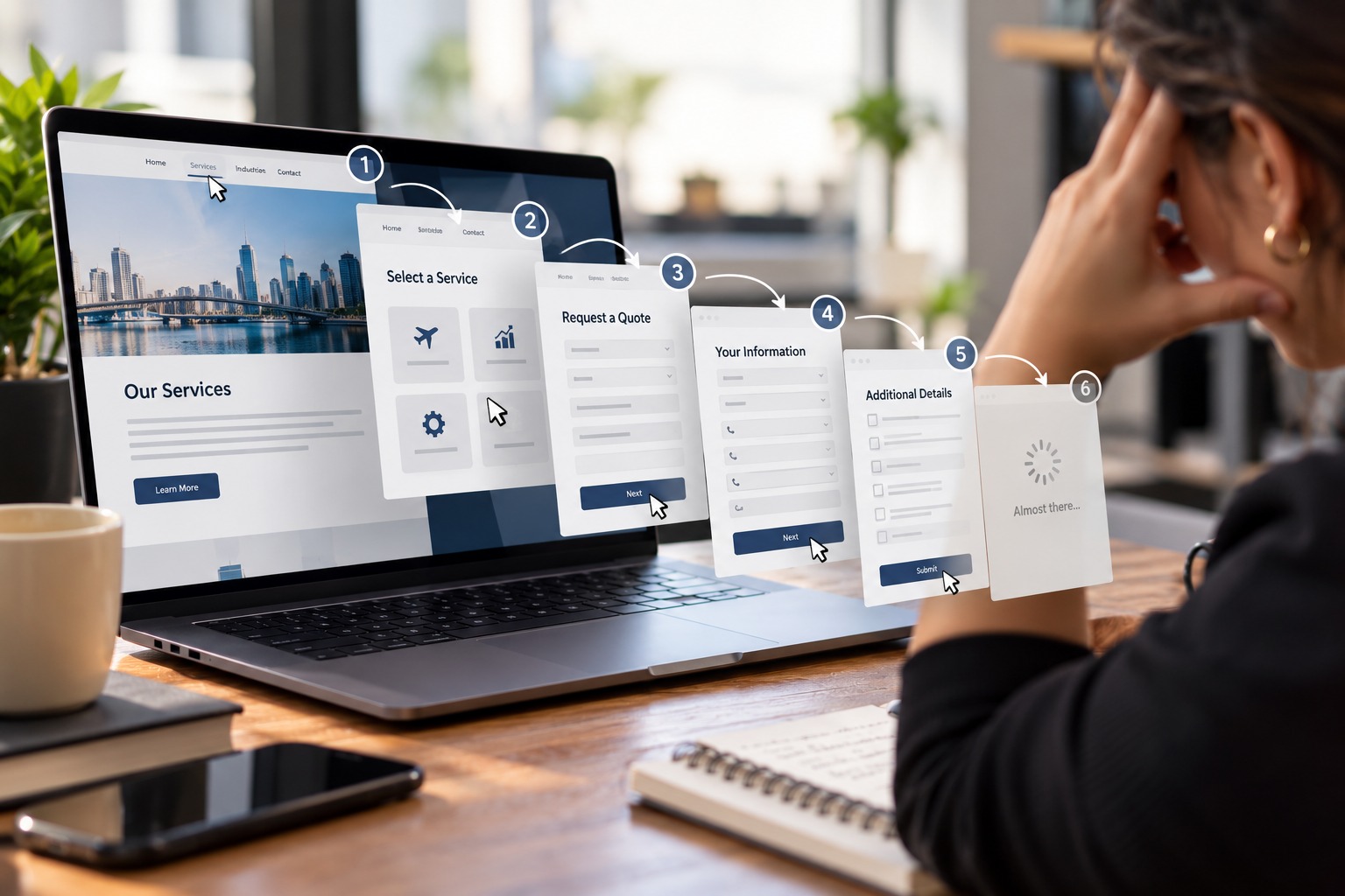
A conversion rarely disappears because a website displays a giant message telling someone to leave. More often, it is lost through small obstacles: a form asking for too much information, a button that does not explain what happens next, a slow page, pricing that is difficult to find, or a process that makes users think harder than necessary. That is digital friction: effort that adds no value to what the customer is trying to accomplish.
Friction appears when the business asks before it gives
Requesting a phone number, job title, company name, budget, and ten additional details before clearly communicating value may make perfect sense to a sales team. To someone who is just beginning to explore, however, it can feel like too much too soon.
Every request creates a small exchange. The customer is giving something, whether information, attention, or time. The business needs to provide enough value to justify that exchange.
Every unnecessary decision consumes attention
Two buttons with ambiguous labels, an oversized navigation menu, or redundant steps create small questions for the user.
One may not matter. Five in a row can.
The problem is not simply the number of clicks. It is how much uncertainty accompanies them. When users repeatedly have to stop and figure out what to do next, continuing becomes harder than leaving.
Forms are a good place to start
Baymard Institute’s research on e-commerce usability has documented how checkout and form design can influence the user experience and conversion process.
The principle extends beyond online stores. Whether someone is requesting a quote, booking a consultation, downloading information, or creating an account, ask only for the information necessary to complete the next meaningful step.
There will always be opportunities to gather more information later.
Reducing friction does not mean removing context
A process can also become too short.
Removing useful explanations, expectations, pricing context, or confirmation messages may leave users with more questions than answers.
The objective is not “fewer clicks” at any cost. It is making sure every click has a clear purpose and moves the user closer to what they came to accomplish.
The best audit starts by watching someone use the website
Internal teams know their own processes too well.
Watching someone unfamiliar with the business try to request a quote, register, find pricing, understand a service, or contact the company can reveal obstacles that employees stopped noticing months ago.
Sometimes the most valuable website insight is not hidden inside an analytics dashboard. It comes from watching where a real person hesitates.
Every Unnecessary Step Gives the Customer a Way Out
Before investing in another campaign to send more people to a page, it is worth examining what happens after they arrive.
Consulting Suma connects strategy, digital experience, and execution to identify where a business is adding effort without adding value. Removing that friction does not simply make a website easier to use. It can make the path from interest to action much clearer.
